
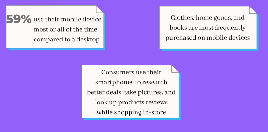
Over the past few years, smartphones have evolved quite a lot. Internet consumption on smartphones and tablet devices has increased considerably. Users are spending more time with their smartphones than their computers.
Hence, responsive website designs are necessary to give the same experience of using the website on every device. Every website owner these days wants a responsive website design. So, what is responsive website design? Why are they so important? What are the key components of responsive web design? Let’s begin the discussion with a little introduction to responsive website design. And further will cover all the above questions too.
What is a responsive website design?
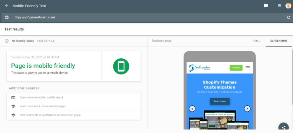
- Open Google Chrome
- Go to your website
- Press Ctrl + Shift + I or F12 to open Chrome DevTools
- Press Ctrl + Shift + M or Click Mobile Icon to toggle the device toolbar
- View your page from a mobile, tablet, or desktop perspective
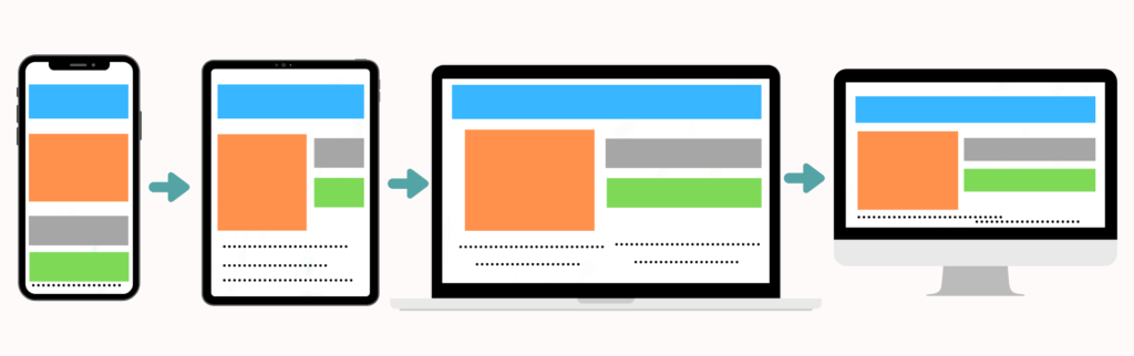
Responsive Website Design is a concept that suggests that the website should look, feel, and behave the same on every device and platform. The user may be visiting the website from desktop, mobile, and tables, but the experience of using the website should be the same.
The website design components such as text, images, graphics, or any other type of content should be automatically reorganized according to the user’s screen size. And the website should deliver the same web browsing experience on every device.
The attractive website design includes using flexible grids, layouts, images, and intelligent application of CSS media queries. It automatically adjusts itself according to the device’s different screen resolutions, image sizes, and scripting abilities. Ultimately, it eliminates creating separate websites for laptop, mobile, and desktop screen sizes.
Why does the responsive website design matter the most?
Now as we know the basic concept of responsive website design, it’s time to discuss its importance and why it matters the most in 2021. Here are some of the most obvious reasons for having a responsive website design. Let’s discuss them one by one.
Smartphone internet consumption has witnessed an enormous rise
As per the report from Statista, in the 4th quarter of 2019-2020, mobile devices alone generated 52.6% of global website traffic. And this number kept on increasing. And responsive website design delivers almost the same experience as a desktop site. If any business wants to survive in this most competitive environment, it is high time to invest in responsive website design.
Better user experience
The responsive website design delivers the best experience of web browsing. The user will get the same experience of browsing your website on mobile, tablets, or computers of any screen size. The website will adjust itself according to the size of the screen. Business owners will be able to deliver better user satisfaction. And that is what matters.
Easy management of the website
Before the concept of responsive website design, developers and businesses used to have only two options. Either they can create a website that looks convenient on mobile & desktop, or they can create a separate mobile site, which used to consume a lot of time & resources for developers and website owners.
On the other hand, a responsive website design requires no such efforts. Hence more and more businesses are coming up with their websites. Unless the user wants to add additional features to the site, they do not need the assistance of a web designer for every little aspect of the website. The user by themself can update the website.
Search engine optimization(SEO) benefits
Search engine optimization(SEO) is a process using which businesses can improve the search engine ranking of their website. Whenever any user searches for their business-related term in the browser, the business owner’s website should come in the first position on the search engine result page. It delivers them more sales, conversions, and quality leads.
Hence to survive in this competitive business environment, the search engine presence of the businesses is a must. And having a responsive website design that works seamlessly on mobile devices is a must for the search engine. A mobile-friendly website is one of the biggest ranking factors for search engines. To achieve many search engine rankings, a responsive website is a must.
Low bounce rates
The bounce rate is also a prominent search engine ranking factor. Bounce rate means the percentage of visitors who leave your site after viewing only one page of your website. A higher bounce rate means more visitors leave your site by glancing at it.
A responsive website design reduces the chance of users bouncing off your site. The slick design scheme & smooth UX of your website will make users explore more of your website. The more time the user spends works as a positive signal for the search engines.
The best website performance & speeds on mobile
Responsive website design delivers better speed and performance for your website. And search engines always reward websites with faster load times. A faster website is also a critical ranking factor for the search engine. And it ultimately delivers a better experience of using your website to the end-user. A more satisfied user means more traffic, engagement, sales, and conversion.
Cost friendly
Over the past few years, the cost of website development has reduced considerably. And one of the major reasons behind that is the responsive website design. The website owners are not required to invest in multiple website versions. Only one version of the site serves visitors on all devices with different screen sizes.
What are the newest components of responsive web design
Responsive website design includes multiple components and elements. Here we have mentioned a few of the leading ones and discussed them in brief.
Website navigation
Website navigation is one of the most vital parts of any website. Please place it according to the browser’s width. For mobile users, the navigation is placed on top or center, which will be easier to access with figures. And for the wider screen should be placed around the top right corner or near the logo. While deciding the right navigation position, the user’s ease of access should be the top priority. The below example will give you a better idea of navigation placement.
Columns management
The website design of Boston Globe has done a great job with its website design. The number of columns on their website changes according to the screen size. On the desktop, the site will open with three columns. And on mobile, it automatically switches to one column. This website would be a great example for newbie designers. And this is how we should manage the number of columns on the website.
Call to action buttons
Call to action(CTA) buttons are ones using which final conversion happens. Despite any browser or screen size, good website design will always have its CTAs in the right place. They should always be. Here also, the ease of accessibility and usability according to the screen size should be the top priority. The below given example will give a better understanding of the same.
Flexible images & media
The flexibility of images & media queries is also a key feature of flexible website design. We can have multiple versions of the same image on the server and serve them according to screen sizes using the server-side or client-side feature. And the media queries should also be able to adapt to different sizes of the users’ screens. Both of them play a huge role in the overall user experience. Here is an example for a better understanding.
Branding
Branding works as the core of any website design. Playing around with flexible grid sizes should help the branding of your site. The website should be designed for three to four-width sizes. The designers should ensure that on any screen size, the site should not lose its true brand essence. The site should seamlessly represent the same branding tone regardless of screen size. The below given an example will give a better idea of the same.
The conclusion
The internet penetration on smartphones is at an all-time high. For the upcoming decade, smartphones are the future. This is where all the conversions will take place in the future. It’s time to invest in attractive, responsive website design and we are the Shopify experts to build this for you. This little guide will give you concise knowledge about responsive website design. Thanks for reading till the end!
