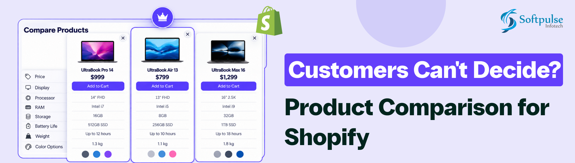
When customers visit a Shopify store, having more choices can seem like an advantage. A wider catalog gives shoppers more products to explore, compare, and potentially buy.
But there is another side to having a large catalog, too many similar choices can make the buying decision harder.
A well-designed product comparison experience brings relevant information together so shoppers can understand differences without repeatedly moving between product pages. Shopify itself describes comparison tables as a way for customers to quickly assess similarities and differences between products.
For Shopify merchants, this creates an important opportunity, instead of asking customers to do the comparison themselves, give them a clear way to do it directly on the store.
Why Customers Struggle to Choose Between Similar Products
Customers rarely want to study every product in your catalog. They usually have a specific need and are trying to identify the product that best matches it.
The difficulty increases when products share similar names, images, designs, prices, or descriptions.
For example, consider a skincare store selling three moisturizers:
| Product | Main Difference | Customer Question |
| Daily Hydration Cream | Lightweight formula | Is it suitable for everyday use? |
| Intensive Moisture Cream | Richer formula | Is it better for dry skin? |
| Hydration Gel | Gel-based texture | Will it feel lighter on the skin? |
A customer can visit all three product pages, read the descriptions, and manually remember the differences. But that requires unnecessary effort.
A better experience puts the important information in one place.
This matters because online shopping removes the physical experience of picking up two products and comparing them side by side. A physical shopper can often look at two items simultaneously. An online shopper may need several tabs, screenshots, notes, or repeated page visits to achieve the same thing.
The Customer’s Real Problem Isn’t Always “Which Product?”
Often, the real question is:
“What is the difference between these products?”
That distinction matters.
A shopper who has already narrowed their search to three products is often close to making a decision. They may simply need clearer information.Consider a customer shopping for headphones:
- Product A costs $79
- Product B costs $99
- Product C costs $129
Price alone doesn’t tell the customer which product is right.They may want to know:
- Does it have noise cancellation?
- How long does the battery last?
- Is it compatible with their device?
- Does it support a particular connection type?
- Is it water resistant?
- What is the weight?
- What comes in the box?
If these details are spread across three separate product pages, the customer has to perform the comparison manually.
A clear product comparison table can turn that scattered information into an easy-to-scan view.
If your store needs functionality beyond existing apps, custom Shopify app development can help you build solutions around your specific business needs. From custom features to Shopify API integrations, Softpulse Infotech provides Shopify app development services tailored to your store.
What Happens When Customers Have to Compare Products Manually?
Manual comparison creates several small points of friction. None of them necessarily causes a customer to leave immediately, but together they can make the shopping experience unnecessarily difficult.
1. Customers open multiple product pages
The shopper opens Product A, then Product B, then Product C. They move back and forth trying to remember what they saw.
2. Customers forget important specifications
A customer may remember that one product had better battery life but forget which model it was.
3. Customers compare the wrong details
Long product descriptions often contain plenty of information, but customers may not know which specifications actually distinguish one product from another.
4. Customers struggle with variants
A product may have different sizes, capacities, configurations, or versions. Understanding how those options differ can become difficult when information isn’t presented together.
5. Mobile shopping makes comparison harder
On a desktop, shoppers can keep multiple tabs open. On mobile, repeatedly navigating between product pages can be even more frustrating.
6. Customers postpone the decision
When the answer isn’t obvious, the customer may decide to “come back later.
”That doesn’t always mean the store loses the customer permanently, but it introduces another opportunity for the purchase journey to break.
How Product Comparison Makes the Buying Decision Easier
The purpose of comparison isn’t to give customers more information.
It is to give them the right information in a format that makes differences easy to understand. A useful comparison experience should answer questions such as:
- Which product costs less?
- What features are different?
- Which product has the specification I need?
- What do these products have in common?
- Which variant is suitable for my use case?
- Is the more expensive product actually offering something extra?
A comparison table can organize these details into rows and columns, allowing shoppers to scan several products at once. Shopify recommends focusing comparison charts on the features that matter most to customers rather than overwhelming them with every possible detail.
What Should Customers Be Able to Compare?
Not every product needs the same comparison fields.
A good comparison experience should reflect the buying criteria for that particular product category.
Common comparison fields include:
| Comparison Factor | Example | Why It Matters |
| Price | $79 vs. $99 | Helps shoppers evaluate value |
| Size | Small / Medium / Large | Important for fit and usability |
| Material | Cotton / Linen / Polyester | Helps customers understand product differences |
| Specifications | 8GB RAM / 16GB RAM | Useful for technical products |
| Features | Noise cancellation / Waterproofing | Shows functional differences |
| Capacity | 500ml / 1L | Helps customers choose based on usage |
| Compatibility | iOS / Android / Universal | Prevents unsuitable purchases |
| Warranty | 1 year / 2 years | Helps evaluate long-term value |
| Availability | In stock / Out of stock | Helps customers identify purchasable options |
The key is relevance. A comparison table for electronics will look very different from one for clothing, furniture, cosmetics, or sports equipment.
Highlight the Differences Customers Actually Care About
One of the most useful approaches is to make meaningful differences visually easier to identify.
Suppose three products have these specifications:
| Feature | Product A | Product B | Product C |
| Price | $49 | $69 | $89 |
| Battery | 10 hours | 15 hours | 20 hours |
| Waterproof | Yes | Yes | Yes |
| Fast Charging | No | Yes | Yes |
| Warranty | 1 year | 1 year | 2 years |
The fact that all three products are waterproof may not help the customer distinguish between them.
Battery life, fast charging, warranty, and price may be more useful factors in decision-making.
This is where features such as highlight differences and hiding similarities can improve the experience. Equate – Product Compare supports both options, making meaningful differences more visible rather than forcing customers to scan identical information.
Product Comparison Can Be Especially Useful for Stores
Some Shopify stores naturally need comparison more than others. For example:
Electronics Shopify Store
Customers frequently compare technical specifications, compatibility, battery life, storage, processor performance, and price.
Fashion Shopify Store
Customers may compare materials, sizes, colors, styles, fits, and product variations.
Furniture Shopify Store
Dimensions, materials, seating capacity, colors, assembly requirements, and warranty can influence the decision.
Beauty Shopify Store
Customers may compare ingredients, skin type, benefits, size, formulation, and usage.
Sports and fitness Shopify Store
Weight, dimensions, material, capacity, resistance, compatibility, and intended use can make one product more suitable than another.In all of these cases, the merchant may have excellent products but still create friction if customers can’t easily understand how those products differ.
Don’t Forget Product Variants
Comparison shouldn’t necessarily stop at individual products.Customers may also need to compare variants or configurations. For example, a merchant might sell the same product in:
- 500GB, 1TB, and 2TB storage
- Small, Medium, and Large sizes
- Basic, Pro, and Premium configurations
- Different colors or materials
The important thing is to help customers understand whether the differences are meaningful for their specific needs. Equate – Product Compare supports product and variant comparison, giving merchants a way to present these differences within the comparison experience.
Where Should Product Comparison Be Available?
Customers don’t always begin their journey from the same place. Some start on a product page. Others browse a collection first.
For that reason, comparison functionality can be useful in multiple parts of a Shopify store.
Product pages
A customer who is already considering a product can add it to a comparison list and continue exploring alternatives.
Collection pages
A shopper browsing several similar products can select products for comparison without repeatedly opening every product page.
Dedicated comparison pages
A dedicated comparison page gives shoppers a focused place to review selected products side by side. Equate supports comparison on both product and collection pages, as well as dedicated comparison tables/pages.
Mobile Comparison Matters
A large part of ecommerce browsing happens on smartphones, so comparison functionality shouldn’t be designed only for desktop screens.
For merchants, the goal is straightforward: If customers can compare products comfortably on mobile, they don’t have to leave the comparison process simply because they changed devices.
How to Build a Customer-Friendly Comparison Experience
Here’s a practical process Shopify merchants can follow.
Step 1: Identify where customers get confused
Look at your catalog.Are customers frequently choosing between:
- Similar models?
- Different versions?
- Different sizes?
- Different materials?
- Different specifications?
- Different price tiers?
Those are good candidates for comparison.
Step 2: Identify the questions customers ask
Customer support conversations, product reviews, search queries, and sales-team questions can reveal what shoppers struggle to understand.If customers repeatedly ask:
“What’s the difference between these two?”
that’s a strong signal that the store could make those differences clearer.
Step 3: Select meaningful comparison fields
Don’t automatically add every product attribute. Choose the specifications that influence the purchase decision.
Step 4: Make differences easy to scan
Use clear labels and consider highlighting meaningful differences or hiding repetitive information.
Step 5: Include relevant variants
If customers frequently compare configurations or versions, make sure those options are understandable.
Step 6: Test the experience on mobile
Ask someone unfamiliar with the store to compare two or three products on a smartphone. Watch where they hesitate. That can reveal UX issues that aren’t obvious from the merchant side.
Step 7: Keep improving the comparison fields
Your first comparison table doesn’t need to be perfect. Use customer behavior and support questions to identify which information is useful and which information can be removed.
Equate – Product Compare: A Practical Solution for Shopify Merchants
For Shopify merchants looking to add this functionality without building a comparison system from scratch, Equate Product Compare Shopify App is designed around this exact customer problem.
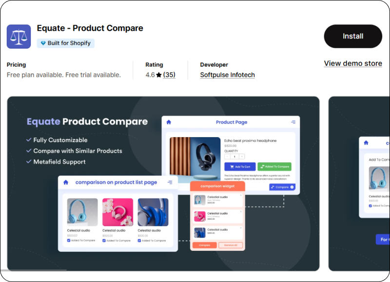
The app lets shoppers compare multiple products and variants while giving merchants control over the information displayed in the comparison experience. Its current feature set includes comparison tables and pages, product and collection-page comparison, specifications, metafields/custom fields, highlighting differences, hiding similarities, responsive layouts, customization, multi-language support, filtering/sorting, and other comparison options.
Softpulse Infotech has also been developing Shopify solutions for years, and Equate has been available on the Shopify App Store since 2014. The app is currently listed as Built for Shopify and offers a free plan/free trial structure, with paid functionality available for stores that need additional capabilities.
FAQs
1. What is product comparison in Shopify?
Product comparison allows shoppers to evaluate two or more products side by side using information such as price, features, specifications, variants, and other product attributes. It is particularly useful when a store sells similar products that customers may find difficult to distinguish.
2. Does product comparison help customers choose between similar products?
Yes. A comparison experience can reduce the effort required to identify differences between similar products. Instead of switching repeatedly between product pages, shoppers can review relevant information in one place.
Conclusion
Customers don’t necessarily leave a Shopify store because they don’t like the products.
Sometimes, they leave because choosing between the products is harder than it should be.
When several products look similar, customers need a clear way to understand what separates them. Asking shoppers to open multiple pages, remember specifications, compare variants manually, and switch between tabs puts unnecessary work on the customer.
For Shopify merchants with large catalogs or multiple similar products, Equate – Product Compare from Softpulse Infotech provides a practical way to bring that experience directly into the storefront, with support for products, variants, specifications, metafields, difference highlighting, customization, product and collection pages, and mobile-responsive comparison.